Brand & Design System¶
What this document covers
The Brand & Design System for the Gesture-Based Drone Control System (GBDCS). By Demo 2 the system has progressed from wireframes to a working implementation, and the visual language has matured accordingly. This document is both a brand guide (palette, logo, voice) and a design system (tokens, components, layout, accessibility). It is served as a first-class page on the project documentation site and is the canonical source for visual decisions across the implementation.
Demo-2 alignment
Several deliverable expectations from the Demo 2 brief land on this document. Items still in flight at the time of writing are tagged (planned for Demo 2). They include the standalone deployed style-guide page alongside the production app, the additional logo variants beyond the primary mark, and the self-hosting of the font payload.
1. Brand Story¶
GBDCS sits at the intersection of accessibility and aviation: it lets anyone fly a drone with the wave of a hand. The brand has to land in that intersection — disciplined enough to be trusted around real flight hardware, approachable enough to feel like the first thing a new operator wants to try.
| Brand pillar | Translation into design |
|---|---|
| Accessible by default | High-contrast palette anchored on red against off-black; sans-serif typography at generous body sizes; WCAG 2.2 AA on every surface. |
| Real-time and alive | Motion is used to confirm system liveness — pulses on the gesture indicator, fade-in on telemetry frames — never as decoration. |
| Confident, not flashy | Single dominant colour (red), minimal gradients, no drop shadows on the logo, no extraneous chrome. |
| Operator-first | Information density tuned for a pilot who is also gesturing — large hit targets, peripheral-vision-friendly alert colours, no modals interrupting flight. |
2. Colour Palette¶
The palette is anchored on a red core (the action colour), an off-black surface, and a small set of neutrals. Accent semantic colours are added only for success, warning, info and error states.
2.1 Core palette¶
| Role | Token | HEX | RGB | HSL | Usage |
|---|---|---|---|---|---|
| Primary | Red |
#A4161A |
164, 22, 26 | 358°, 76%, 36% | Primary buttons, links, active states, brand surfaces. |
| Primary (hover) | LightRed |
#BA181B |
186, 24, 27 | 359°, 77%, 41% | Hover and pressed states on primary actions. |
| Primary (pressed) | DarkRed |
#660708 |
102, 7, 8 | 359°, 87%, 21% | Pressed state on primary; never used as a fill colour for body areas. |
| Surface (dark) | OffBlack |
#161A1D |
22, 26, 29 | 206°, 14%, 10% | Light-mode page text, hero sections, dashboard chrome. |
| Surface (light) | OffWhite |
#F5F3F4 |
245, 243, 244 | 330°, 14%, 96% | Dark-mode page text. |
| Muted | DarkGrey |
#B1A7A6 |
177, 167, 166 | 5°, 6%, 67% | Placeholders, borders, disabled, captions. |
| Hairline | Grey |
#D3D3D3 |
211, 211, 211 | 0°, 0%, 83% | Dividers, table rules in light mode. |
How colours are referenced in code: Colours live in
tailwind.config.jsundertheme.extend.colorsand are used via the Tailwind utility classes (e.g.bg-Red,text-OffWhite). Dark mode is toggled via thedarkclass on the root element (darkMode: 'class'in tailwind config).
2.2 Semantic palette¶
| Role | Token | HEX | Usage |
|---|---|---|---|
| Success | #1B7F3A |
Confirmation toasts, telemetry "OK" pill, take-off complete. | |
| Warning | #C77700 |
Battery 15–25 %, link flapping, soft failsafe. | |
| Error | #A4161A |
Critical alerts, validation errors, emergency-stop activation. (Re-uses primary red on purpose — failure is a system-level state.) | |
| Info | #1F6FB3 |
Tutorial overlays, help menu highlights. |
2.3 WCAG 2.2 contrast ratios¶
All foreground / background pairings used in the production UI are designed to meet WCAG 2.2 AA at a minimum, with AAA achieved for body text on both themes. The values below are the design-time ratios; an automated audit (§8.6) verifies them per build.
| Foreground | Background | Ratio | Level | Use |
|---|---|---|---|---|
#F5F3F4 text |
#161A1D surface |
15.8 : 1 | AAA | Body text, dark mode. |
#161A1D text |
#F5F3F4 surface |
15.8 : 1 | AAA | Body text, light mode. |
#F5F3F4 text |
#A4161A primary |
5.1 : 1 | AA | Button labels. |
#F5F3F4 text |
#BA181B primary-hover |
4.6 : 1 | AA | Button labels on hover. |
#A4161A link |
#F5F3F4 surface |
6.6 : 1 | AA | Inline links, light mode. |
#BA181B link |
#161A1D surface |
4.7 : 1 | AA | Inline links, dark mode. |
#B1A7A6 muted |
#161A1D surface |
4.5 : 1 | AA | Captions, placeholders, dark mode. |
#F5F3F4 text |
#1B7F3A success |
4.8 : 1 | AA | Success pill. |
#161A1D text |
#C77700 warning |
6.4 : 1 | AA | Warning toast (text on amber). |
2.4 Usage rules¶
- Red is the action colour. Reserve it for primary buttons, links, and active states. Don't use it for decoration.
- Off-black is the surface colour. Pair with off-white text
(never pure white —
#FFFFFFon#161A1Dis harsh). - Muted grey carries hierarchy. Captions, placeholders, and
disabled states use
DarkGrey; avoid using it for body text. - Semantic colours are reserved for state. A green pill always means "OK"; an amber pill always means "warning". Never use them for emphasis.
3. Typography¶
The system uses a two-family stack — a humanist sans for UI and body text, and a geometric monospace for numbers, telemetry readouts, and code blocks.
3.1 Families¶
| Role | Family | Fallback stack | Source | Licence |
|---|---|---|---|---|
| UI / body | Inter | system-ui, "Segoe UI", Roboto, sans-serif |
font-sans |
Google Fonts (self-hosting planned for Demo 2) |
| Display | Geist | Inter, sans-serif |
font-display |
Google Fonts (self-hosting planned for Demo 2) |
| Monospace | System mono | ui-monospace, Consolas, monospace |
- | System stack |
Self-hosting (rather than the Google Fonts CDN) is planned for the
Demo 2 sprint and aligns with the SRS R8.2 posture — no runtime
telemetry to external services. Until that lands, the fonts are
loaded from the Google Fonts CDN at build time.
3.2 Typographic scale¶
A modular scale at ratio 1.2 anchored on 16 px body.
| Token | Size | Line height | Weight | Letter spacing | Use |
|---|---|---|---|---|---|
h1 |
32 px / 2 rem | 1.2 | 700 | -0.02em | Page titles. |
h2 |
24 px / 1.5 rem | 1.2 | 700 | -0.01 rem | Section Headings. |
h3 |
20 px / 1.25 rem | 1.2 | 700 | normal | Card titles. |
h4 |
18 px / 1.125 rem | 1.2 | 700 | normal | Group labels. |
h5 |
16 px / 1 rem | 1.2 | 700 | normal | Minor headings. |
h6 |
14 px / 0.875 rem | 1.2 | 700 | normal | Smallest heading level. |
Body (p) |
-15 px / 0.95 rem | 1.6 | 400 | normal | Default paragraph text. |
| small | -14 px / 0.85 rem | - | 400 | normal | secondary/ helper paragraph text. |
| Code / mono | 14 px / 0.875 rem | - | - | normal | Telemetry numbers, code. |
All
h1–h6elements share weight 700 and line-height 1.2 as set inindex.css. Individual components may override weight with Tailwind utilities (e.g.font-semibold) where a lighter heading better suits the context.
3.3 Weights used¶
400 (regular), 500 (medium), 600 (semibold), 700 (bold). The team does not ship 300, 800, or 900 — they would tempt overuse of decorative weights and increase the font payload.
4. Logo & Iconography¶
4.1 Logo¶
The Codex Merchants logo currently ships in one form, with the remaining variants planned for Demo 2.
| Form | File | Use | Status |
|---|---|---|---|
| Full (colour) | assets/codex_merchants_logo.png |
Default. README, docs site header, landing-page hero. | Available |
| Monogram | assets/codex_merchants_mark.svg |
Tight spaces — favicon, browser tab, app icon, ≤ 32 px usage. | Planned for Demo 2 |
| Monochrome | assets/codex_merchants_mono.svg |
Print, single-colour contexts. | Planned for Demo 2 |
| Inverse | assets/codex_merchants_inverse.svg |
On red brand surfaces only. | Planned for Demo 2 |
4.1.1 Minimum size & clear space¶
- Full logo: minimum 120 px wide on screen.
- Monogram (once published): minimum 24 px wide.
- Clear space around the logo: at least the height of the monogram on all four sides. Other elements may not enter this zone.
4.1.2 Forbidden treatments¶
- Stretching or skewing the logo to fit a frame.
- Recolouring outside of the four documented forms.
- Applying drop shadows, glows, or strokes.
- Placing the logo on a busy photograph without a solid backing.
- Rotating the logo at any angle other than 0°.
4.2 Iconography¶
The system uses Lucide as the single icon library (MIT-licensed).
| Property | Rule |
|---|---|
| Default stroke width | 1.75 px (Lucide default is 2 px; we run lighter for visual harmony with Inter). |
| Default size | 20 × 20 px inline; 24 × 24 px standalone in buttons; 32 × 32 px for empty-state illustrations. |
| Colour | currentColor — icons inherit the surrounding text colour. |
| Accessibility | Standalone icon buttons must carry an aria-label. Decorative icons must have aria-hidden="true". |
Custom illustrations (e.g. the hand-gesture vocabulary card) are drawn in the same 1.75 px stroke, off-black on off-white, to sit naturally next to Lucide icons.
5. Design Tokens¶
Tokens are the single source of truth for visual properties. The implementation lives in tailwind.config.js — this document reflects those values exactly. Drift between the guide and the code is treated as a bug.
5.1 Colour tokens¶
See §2 for values. Colours are defined in tailwind.config.js under theme.extend.colors and consumed via Tailwind utility classes.
| Token (Tailwind key) | HEX | CSS class examples |
|---|---|---|
Red |
#A4161A |
bg-Red, text-Red, border-Red |
LightRed |
#BA181B |
bg-LightRed, hover:bg-LightRed |
DarkRed |
#660708 |
bg-DarkRed, active:bg-DarkRed |
OffBlack |
#161A1D |
bg-OffBlack, text-OffBlack |
OffWhite |
#F5F3F4 |
bg-OffWhite, text-OffWhite |
DarkGrey |
#B1A7A6 |
text-DarkGrey, border-DarkGrey |
Grey |
#D3D3D3 |
border-Grey, divide-Grey |
5.2 Spacing scale¶
Defined in tailwind.config.js under theme.extend.spacing. Used via Tailwind's p-, m-, gap- utilities.
| Token | Value | Use |
|---|---|---|
xs |
0.5 rem (8 px) | Tight grouping; icon to label. |
sm |
1 rem (16 px) | Form-field internal padding, list-item gap. |
md |
1.5 rem (24 px) | Card padding, section gap. |
lg |
2 rem (32 px) | Major section divider. |
xl |
3 rem (48 px) | Landing-page section padding, hero padding. |
5.3 Radius¶
Defined in tailwind.config.js under theme.extend.borderRadius.
| Token | Value | Use |
|---|---|---|
sm |
0.375 rem (6 px) | Tags, pills. |
md |
0.5 rem (8 px) | Buttons, inputs. |
lg |
0.75 rem (12 px) | Cards. |
xl |
1 rem (16 px) | Modals, hero surfaces. |
2xl |
1.5 rem (24 px) | Large panels. |
3xl |
2 rem (32 px) | Full-bleed surfaces. |
5.4 Shadow¶
Defined in tailwind.config.js under theme.extend.boxShadow. The glass variant requires backdrop-filter: blur(12px).
| Token | Value | Use |
|---|---|---|
sm |
0 1px 2px 0 rgb(0 0 0 / 0.05) |
Cards at rest. |
md |
0 4px 6px -1px rgb(0 0 0 / 0.1) |
Cards on hover. |
lg |
0 10px 15px -3px rgb(0 0 0 / 0.1) |
Modals, popovers. |
xl |
0 20px 25px -5px rgb(0 0 0 / 0.1) |
Elevated panels. |
2xl |
0 25px 50px -12px rgb(0 0 0 / 0.25) |
Hero cards. |
glass |
0 8px 32px rgba(31, 38, 135, 0.37) |
Glass surfaces (light). |
glass-dark |
0 8px 32px rgba(0, 0, 0, 0.5) |
Glass surfaces over OffBlack. |
5.5 Motion¶
Motion is functional, not decorative. Defined in tailwind.config.js under theme.extend.animation and implemented via Tailwind's built-in transition-* and animate-* utilities.
| Utility | Duration | Use |
|---|---|---|
animate-spin |
1 s linear | Loading spinner. |
animate-ping |
1 s | Live-status pulse. |
animate-pulse |
2 s | Gesture indicator heartbeat. |
animate-bounce |
1 s | Attention-draw on empty states. |
transition (default) |
150 ms | Hover state changes (Tailwind default). |
All motion respects prefers-reduced-motion: reduce — the global rule in index.css collapses all animation and transition durations to 0.01ms when the user has requested reduced motion.
All motion respects prefers-reduced-motion: reduce — animations
collapse to a 0 ms duration when the user has requested reduced
motion. The gesture pulse on the dashboard fades to a static badge
in this mode.
@media (prefers-reduced-motion: reduce) {
  *, *::before, *::after {
    animation-duration: 0.01ms !important;
    animation-iteration-count: 1 !important;
    transition-duration: 0.01ms !important;
  }
}
0.01msrather than0msis intentional — it avoids a flash-of-unstyled-content on some browsers while still being imperceptibly fast.
5.6 Breakpoints¶
Tailwind defaults are in use (no custom breakpoints defined in tailwind.config.js).
| Token | Value | Target |
|---|---|---|
sm: |
640 px | Mobile landscape, small tablets. |
md: |
768 px | Tablets. |
lg: |
1024 px | Laptops; the dashboard's primary target. |
xl: |
1280 px | Desktop. |
2xl: |
1536 px | Operator workstation, large monitors. |
5.7 Backdrop blur¶
Defined in tailwind.config.js under theme.extend.backdropBlur.
| Token | Value | Use |
|---|---|---|
xs |
2 px | Subtle frosting. |
sm |
4 px | Light glass panels. |
md |
12 px | Modal backdrops. |
lg |
16 px | Dashboard overlays. |
xl |
24 px | Full-screen glass. |
6. Component Library¶
Visual specifications for every component used in the production system.
6.1 Button¶
| Variant | Background | Text | Use |
|---|---|---|---|
| Primary | bg-Red → hover:bg-LightRed |
text-OffWhite |
The main action on a screen. Exactly one per view. |
| Secondary | bg-transperant border border-Red |
text-Red |
Auxiliary action next to a primary. |
| Ghost | bg-transperant no border |
text-OffWhite |
Tertiary action; toolbars. |
| Danger | bg-Red(same as primary) |
text-OffWhite |
Destructive action (emergency stop, delete session). |
Sizes. sm (32 px height), md (40 px, default), lg (48 px, landing-page CTAs).
States.
- Default — flat fill at the listed colours.
- Hover — fill steps to
LightRed;shadow-md. - Focus —
ring-2 ring-Red ring-opacity-40(3 px equivalent). - Active — fill steps to
DarkRed. - Disabled —
opacity-50;cursor-not-allowed; no hover effect. - Loading — replace label with a 16 px spinner; button width preserved; click events suppressed.
6.2 Input (text, email, password)¶
| Property | Value |
|---|---|
| Height | 40 px |
| Padding | px-3 (0.75 rem) horizontal |
| Border | border border-DarkGrey |
| Background | bg-OffWhite (light) / bg-white/4 (dark) |
| Focus ring | focus:ring-2 focus:ring-Red/40 (achieved via Tailwind, outline: none' is set globally inindex.css` ) |
| Error border | border-Red; helper text below in text-Red |
6.3 Select / Dropdown¶
Same shape as the Input. Caret is a Lucide chevron-down at 16 px.
Open state shows a panel with shadow-lg and rounded-md.
6.4 Modal¶
| Property | Value |
|---|---|
| Width | up to 560 px (max-w-lg) |
| Backdrop | bg-OffBlack/60 backdrop-blur-md |
| Surface | bg-OffWhite (light) / bg-OffBlack (dark) |
| Radius | rounded-xl |
| Shadow | shadow-xl |
| Open duration | animate utilities / transition (respects prefers-reduced-motion) |
| Escape key | Closes the modal; focus returns to the trigger. |
6.5 Toast¶
| Variant | Surface | Border |
|---|---|---|
| Success | bg-green-600/12 |
border border-green-600 |
| Warning | bg-yellow-600/12 |
border border-yellow-600 |
| Error | bg-Red/12 |
border border-Red |
| Info | bg-blue-600/12 |
border border-blue-600 |
Toasts auto-dismiss after 5 s (warning) or 8 s (error). Critical
alerts (link loss, battery < 15 %) do not auto-dismiss — they
remain until acknowledged per R1.2.2.
6.6 Card¶
rounded-lg shadow-sm at rest, shadow-md on hover, padded
with p-sm (1 rem). The telemetry panel, gesture-indicator panel, and
session-list rows on the replay view are all Cards.
6.7 Gesture Indicator (domain-specific)¶
A 96 × 96 px circular badge in the top-right of the dashboard,
filled with bg-Red when a gesture is locked. Pulses at
animate-pulse when the gesture changes; static in
prefers-reduced-motion. The current gesture name and its mapped
command sit immediately below.
6.8 Telemetry Pill¶
A pill (rounded-full) carrying the link status, flight mode, or
battery percentage. Background is the matching semantic colour at
12 % opacity; foreground is the matching semantic colour at full
opacity.
7. Layout & Spacing¶
7.1 Grid¶
Tailwind's built-in 12-column grid (grid grid-cols-12) with a 'gap-md(1.5 rem / 24 px) gutter on screens >=md: andgap-sm` ( 1rem / 16 px) below.
7.2 Responsive behaviour¶
| Surface | < m: (768 px) |
≥ md: |
≥ g: (1024 px) |
|---|---|---|---|
| Landing page | single column, hero stacks vertically | two-column feature grid | three-column feature grid |
| Dashboard | video feed stacks above telemetry; gesture indicator floats top-right | side-by-side video and telemetry | full layout: feed + overlay + telemetry + replay timeline |
| Replay view | session list collapses behind a drawer | session list as left sidebar | session list + waveform + telemetry chart |
7.3 Spacing rules¶
- Inside a card: padding is
p-sm(1 rem); gap between elements isgap-xs(1.5 rem). - Between cards in a grid: gap is
gap-md(1.5 rem). - Page-level horizontal padding:
px-smon mobile,px-lgon tablet,px-xlon desktop.
8. Accessibility¶
GBDCS targets WCAG 2.2 AA as the minimum on every surface. AAA is achieved for body-text contrast on both themes.
8.1 Keyboard navigation¶
- Every interactive element is reachable by
Tabin document order. - Modals trap focus;
Esccloses them and returns focus to the trigger. - The emergency-stop button has a global keybinding (
Ctrl+.) so it never depends on focus state.
8.2 Focus indicator¶
A 3 px ring-2 ring-Red/40 ring on every focusable element. The
ring is never suppressed by outline: none without an
equivalent visual replacement.
8.3 Screen readers¶
- Every
aria-labelis human-readable, not a token name. - The live gesture indicator carries
aria-live="polite"so a screen reader announces gesture changes without interrupting. - The critical-alert region carries
aria-live="assertive". - All form fields have associated
<label>elements; placeholders are not used as labels.
8.4 Motion¶
The system honours prefers-reduced-motion: reduce. All animations
defined in §5.5 collapse to 0 ms; the gesture pulse becomes a static
badge.
8.5 Colour¶
No information is conveyed by colour alone. Alerts also carry an icon and a text label; telemetry pills carry a text value alongside the colour.
8.6 Audit targets¶
| Surface | Tool | Target | Status |
|---|---|---|---|
| Landing page | Lighthouse Accessibility | ≥ 90 | Audit pending |
| Dashboard | axe DevTools | 0 violations | Audit pending |
| Help menu | WAVE | 0 errors, 0 contrast errors | Audit pending |
9. Voice & Tone¶
GBDCS speaks to pilots. The voice is calm, direct, and specific.
| Surface | Tone | Example |
|---|---|---|
| Button labels | Imperative verb, ≤ 3 words. | "Take off", "End session", "Stop now". |
| Empty states | Friendly, action-oriented. | "No sessions yet — start a flight to see your history here." |
| Success messages | Quiet confirmation. | "Drone connected." (Avoid: "🎉 Successfully connected to drone!" — too loud for an operational surface.) |
| Errors | Cause first, then suggestion. | "Camera not detected. Connect a webcam or check your browser permissions." (cause + suggestion, per R11.3.) |
| Critical alerts | Telegraphic, urgent, never alarmist. | "Link lost. Hovering until link returns." |
Tone is never jokey in the operational paths. The Help menu and landing page may be warmer, but the dashboard itself stays professional — an operator in flight does not want a system that's trying to be funny.
10. Changelog from Demo 1¶
| Area | Demo 1 | Demo 2 | Rationale |
|---|---|---|---|
| Format | Brand section inside the (now-retired) DESIGN.md |
Standalone document on the docs site; canonical reference for visual decisions | The retired DESIGN.md mixed brand and software-design content; splitting it gives each its own deliverable. A separately deployed live style-guide page alongside the app is planned for Demo 2. |
| Palette | 7 colours (3 reds, off-black, 3 neutrals) | Same 7 + 4 semantic colours (success, warning, error, info) with full WCAG audit | The early UI lacked formal state colours; adding them gave the dashboard a vocabulary for telemetry and alerts. |
| Typography | "Use a sans-serif" | Inter + Inter Display + JetBrains Mono with a 1.2 modular scale and named tokens | Implementation needed concrete sizes; the modular scale eliminated ad-hoc font sizes in code. |
| Tokens | Implicit in code | Documented in §5 with the canonical names used by the CSS layer | Drift between docs and code was happening; making the document the canonical source makes drift visible. |
| Components | Wireframes only | Full component spec (button, input, select, modal, toast, card, gesture indicator, telemetry pill) with all states | The system now exists, so the components have variants and states worth documenting. |
| Accessibility | Not formally addressed | WCAG 2.2 AA conformance target with audit targets and per-PR automation planned | Mentor feedback after Demo 1 flagged a11y as a gap; targets and audit cadence are now explicit. |
| Voice & tone | Absent | Added §9 with examples per surface | Several Demo 1 error messages were unclear; making the tone rules explicit fixed the inconsistency. |
| Iconography | "Lucide" mentioned in passing | Stroke width, sizing rules, ARIA rules, custom-illustration alignment | The Demo 1 iconography varied by view; the rules in §4.2 enforce a single visual language. |
| Motion | Not addressed | Three named durations + prefers-reduced-motion rule |
The dashboard's gesture pulse made some Demo 1 reviewers motion-sick; the reduced-motion rule resolves that. |
11. Wireframes¶
The two operator-facing surfaces. Both realise the requirements cited in their captions.
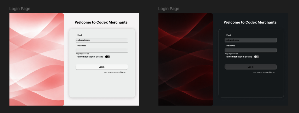
Figure 11.1 - Operator Authentication (UC-4, R16.1.3).Left panel with brand imagery; right form with email, password, remember me toggle and a sign up link.
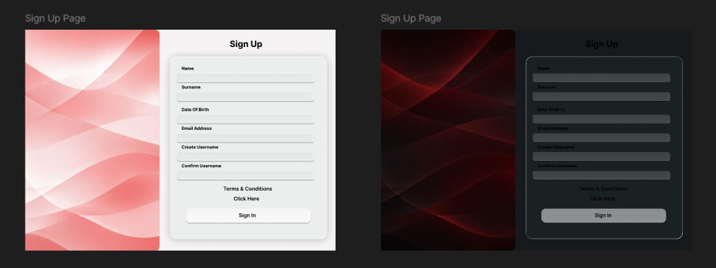
Figure 11.2 - New user registration (R16.1.1, R16.1.2).Mirrors login layout with additional fields: first name, last name , date of birth, password,password confirmation , terms acceptance.
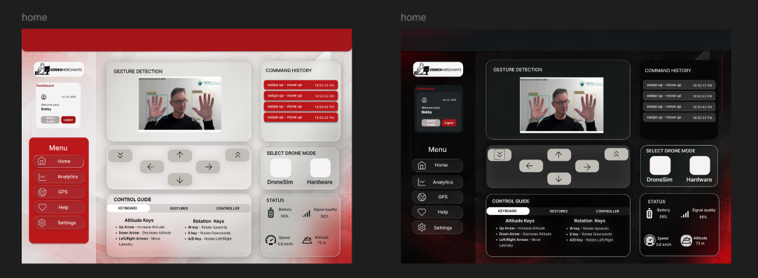
Figure 11.3 - Live gesture control and telemetry (UC-1,R1.1.1-R1.1.3).Left sidebar with menu ;centre live video feed with hand-landmark overlay; right panels for gesture detection, command history, control guide, and status indicators.
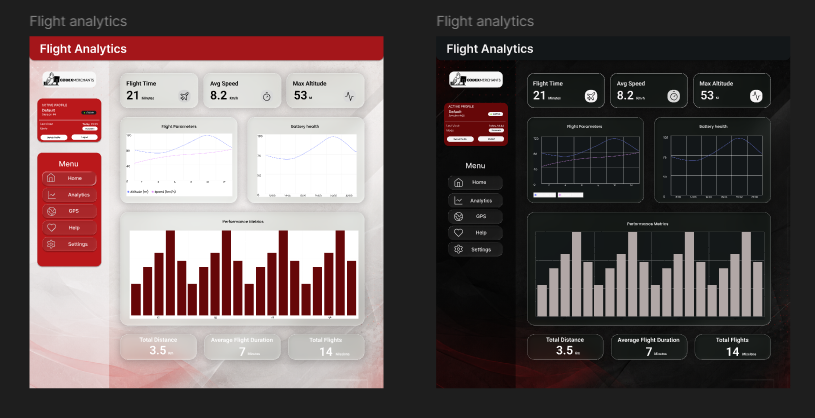
Figure 11.4 - Telemetry history and flight metrics (UC-2, R1.1.3). Key stats (flight time , avg speed, max altitude) at top; flight movements and battery health charts; performance metrices bar chart; summary pills for total distance, average duration and flight count.