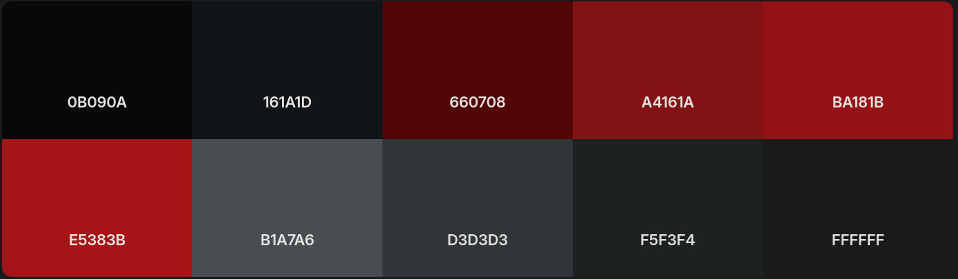
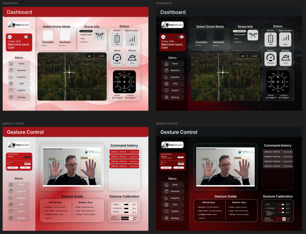
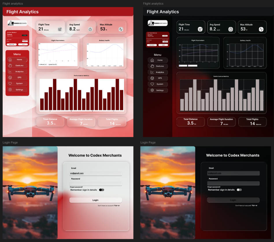
Use bg-LightRed (#BA181B) and bg-Red (#A4161A) as the primary action colours — buttons, links, active states, and CTAs
Use bg-DarkRed (#660708) for hover and pressed states on red elements — never as the dominant colour
Use bg-OffBlack (#161A1D) for dark backgrounds and hero sections; pair with white or OffWhite text for contrast
Use bg-Grey and bg-OffWhite for light mode page backgrounds and surface areas
Use bg-DarkGrey (#B1A7A6) for muted text, placeholders, borders, and disabled states
The glass and glass-dark shadow tokens are designed to sit on top of * OffBlack backgrounds — always pair them with a backdrop-blur-md or higher for the effect to render
Never place red text on a dark red background — contrast is insufficient for accessibility